Quick "Art" post
While I got around to some programming and thinking, neither the thinking nor the programming are done enough yet for a blog post, but here is an image-in-progress that I drew in Inkscape:
![]()
While I got around to some programming and thinking, neither the thinking nor the programming are done enough yet for a blog post, but here is an image-in-progress that I drew in Inkscape:
![]()

I bought the game for 3€ in a Steam sale, and for that money it is well worth the time.
The game runs very smooth on a 16GB machine with an RTX 1080 card.
Story is serviceable. The Bad Guy is Really Evil. You are the son of a resistance fighter in some random tibetan/nepalese/whatever country. Your mother left for the US with you as a child, but for some reason still trained you to be a fighter. At least, nobody mentions or wonders why you are handy with all those weapons that are lying around. Also, nobody asks where you were or how your life was, but accepts you as the son of the former leader. The story sets you up in the game and is motivation for some of the missions, and that's it. It is by lengths better than in Assassins Creed: Origins (the "Egypt" episode).
The gameplay is good. It is a typical UbiSoft game, with lots and lots of collectibles, but at least you can buy maps that list the collectible locations. The fighting is good, despite the occasional QuickTime event.
The intro is unskippable, which is highly inconvenient if the game crashes juuust before the end of the intro. Otherwise I haven't encountered any bad bugs. The convenience of playing old games is that you get to play the best version there is. At least for offline games, where they don't patch out songs from the soundtrack and so on.
The game is connected to the UbiSoft launcher, even when you buy it through Steam. That launcher updates itself every time you launch it through Steam. It also requires a (burner) email address for launching the game. I should maybe start looking for a crack/patch that allows to remove the UbiSoft launcher by replacing it with a small program that mimics it but uses fewer resources.
At least Far Cry 4 does not have microtransactions.
Continuing my quest to using my Google Pixel 9 Pro Android phone as thin client in a docking station, with GrapheneOS build 2026062801, Android 17, previously Android 16.
With the 2026062801 build, you plug the phone into the docking station, select the display mode to extend the screen to the external display, and it just works. The mouse and keyboard input work anyway, and the phone asks you whether to connect the screen as a secondary display or to mirror the phone screen to the external display.
The task bar on the external screen now works without alignment and mouse detection issues.
Opening an app to the big screen or moving it to the big screen now works by launching it from the big screen instead of mobile screen.
Opening the settings from the top pulldown menu on the external screen opens the settings on the small screen. Launching the settings app from the menu launches it on the external screen as it should.
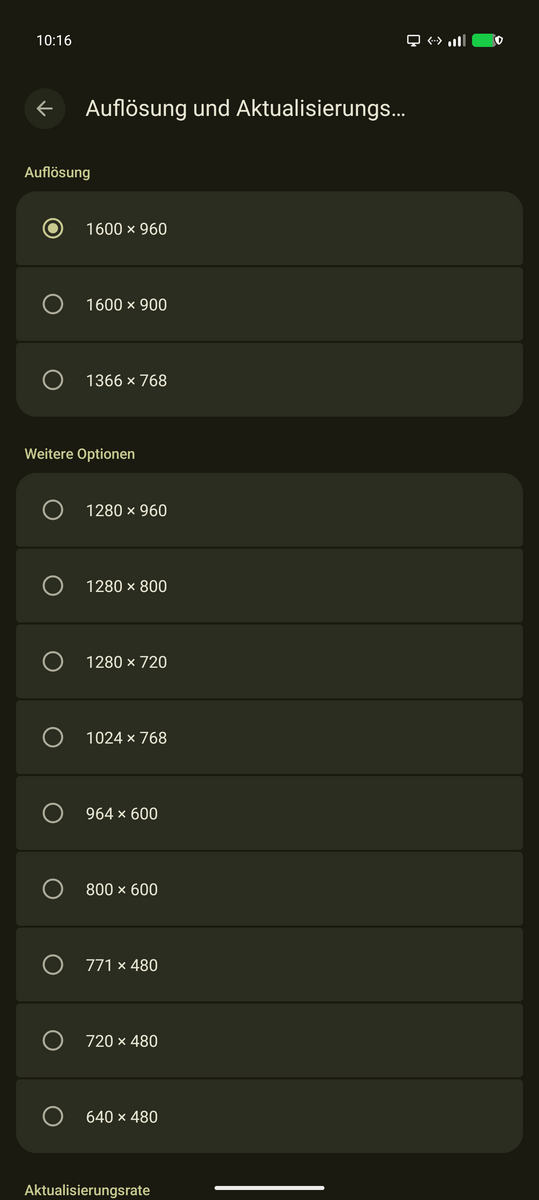
Screen dimensions can now be selected. Weirdly, on a 2560x1600 display, selecting 2560x1600 gave a crisp picture which still was constrained to a 1600x980 like screen with black bars to the left and right. I assume that the external DP alt mode has a limitation to 1600px width in data transfer. On my local 11" 4k display, the different resolutions top out at 2048x1152. This is acceptable for the size of the display, but I would still like to use a larger resolution.
Bluetooth audio output works, but the microphone remains mute.
Initially external cameras did not work inside the $work Citrix workspace app. They get shown by the app but don't show up in Teams. There was a permissions pop-up on the phone screen to allow the app access to the USB-connected external camera, after selecting the external camera in the Citrix app menu. Allowing that permission via the phone screen made the camera usable within MS Teams on the remote end. The camera resolution seemed to be degraded, but that's maybe due to the Logitech 920c camera having a subpar UVC implementation?
The orders for the various USB-C / USB-C cables arrived since the last experiment, and the results vary, as seems to be expected with the new world of basically indistinguishable cabling we live in.
I ordered two Thunderbolt 5 120Gbps, 240W cables, one 0,5m length and one 1m length, with the "5" displayed on the connectors. I also ordered a "Compatible with Thunderbolt 5" cable by SUMPK.
The SUMPK cable has the mildly annoying disfeature that the display connection is not necessarily detected as 1600x900 , but sometimes only as 1280x720. I attribute this to the connection quality.
With the two Thunderbolt 5 "certified" cables, the display resolution gets up to 2048x1152 , but the external display still retains the DPI scaling, so the improvement in fidelity does not result in more information getting shown on the screen.
At least I now have a set of cables that are known good cables for the phone connection and I will bring such a cable with me for when I need to hook up the phone to a docking station.
In the end, the phone is now a workable brain to use as a remote desktop client with Android 17.
I'm not really happy with using Claude Code as my coding harness. Not that I have spent much time in the last three months using the slopmachines, but as the GLM subscription is already paid for and GLM 5.2 just came out, I'm revisiting coding harnesses other than Claude Code, and here is my setup for running pi.dev in a Podman container.
The agent now supports subagents and task lists via plugins. Obra's superpowers is indispensable to me.
I don't believe in large context or large agent conversations, so subagents are a must for me.
Maintaining a task list is also important to me.
The main thing I use for doing agent-driven development
pi needs Nodejs 22+, so the container is based on Debian forky.
pi.devFROM docker.io/library/debian:forky-slim
# debian-forky-slim
RUN <<EOF
apt update
# Install our packages
DEBIAN_FRONTEND=noninteractive TZ=Etc/UTC apt-get install -y npm perl build-essential imagemagick git apache2 wireguard wget curl cpanminus liblocal-lib-perl ripgrep
EOF
RUN <<EOF
# Install pi.dev
npm install -g --ignore-scripts @earendil-works/pi-coding-agent
mkdir /work
export HOME=/root
# 1. Install Superpowers, subagents and task-list plugins
pi install git:github.com/obra/superpowers
pi install npm:pi-subagents
# Create some directories that we want to mount from the outside
mkdir -p /root/.pi/agent/sessions/--work--/
EOF
ENTRYPOINT ["bash"]
CMD ["-i"]
I created a separate API key via z.ai API keys, just in case the API key gets leaked due to a bad plugin.
Documentation from pi.dev providers:
Edit ~/.pi/auth.json:
{
  "zai": {
    "type": "api_key",
    "key": "your API key"
  }
}
Like all coding harnesses, pi.dev also uses a lot of blinking lights to keep the user entertained while they wait for tokens. I removed the background colors by editing ~/.pi/agent/settings.json:
{
    "theme": "transparent"
}
And adding transparent.json to ~/.pi/agent/themes/transparent.json:
{
    "$schema": "https://raw.githubusercontent.com/earendil-works/pi/main/packages/coding-agent/src/modes/interactive/theme/theme-schema.json",
    "name": "transparent",
    "vars": {
            "cyan": "#00d7ff",
            "blue": "#5f87ff",
            "green": "#b5bd68",
            "red": "#cc6666",
            "yellow": "#ffff00",
            "gray": "#808080",
            "dimGray": "#666666",
            "darkGray": "#505050",
            "accent": "#8abeb7",
            "white": "#ffffff"
    },
    "colors": {
            "accent": "accent",
            "border": "blue",
            "borderAccent": "cyan",
            "borderMuted": "darkGray",
            "success": "green",
            "error": "red",
            "warning": "yellow",
            "muted": "gray",
            "dim": "dimGray",
            "text": "white",
            "thinkingText": "gray",

            "selectedBg": "",
            "userMessageBg": "",
            "userMessageText": "",
            "customMessageBg": "",
            "customMessageText": "",
            "customMessageLabel": "#9575cd",
            "toolPendingBg": "",
            "toolSuccessBg": "",
            "toolErrorBg": "",
            "toolTitle": "white",
            "toolOutput": "gray",

            "mdHeading": "#f0c674",
            "mdLink": "#81a2be",
            "mdLinkUrl": "dimGray",
            "mdCode": "accent",
            "mdCodeBlock": "green",
            "mdCodeBlockBorder": "gray",
            "mdQuote": "gray",
            "mdQuoteBorder": "gray",
            "mdHr": "gray",
            "mdListBullet": "accent",

            "toolDiffAdded": "green",
            "toolDiffRemoved": "red",
            "toolDiffContext": "gray",

            "syntaxComment": "#6A9955",
            "syntaxKeyword": "#569CD6",
            "syntaxFunction": "#DCDCAA",
            "syntaxVariable": "#9CDCFE",
            "syntaxString": "#CE9178",
            "syntaxNumber": "#B5CEA8",
            "syntaxType": "#4EC9B0",
            "syntaxOperator": "#D4D4D4",
            "syntaxPunctuation": "#D4D4D4",

            "thinkingOff": "darkGray",
            "thinkingMinimal": "#6e6e6e",
            "thinkingLow": "#5f87af",
            "thinkingMedium": "#81a2be",
            "thinkingHigh": "#b294bb",
            "thinkingXhigh": "#d183e8",

            "bashMode": "green"
    }
}
Some short reviews of books that I recently read
Quite good and entertaining. A space opera that follows a being that cannot be killed from a society of libertarian hyper-capitalism through other societies. The corporate-run society is shown quite imaginatively, with the protagonist trapped in its value system.
I really disliked the protagonist, so props to the author for writing some really unlikeable, trapped protagonist. Content-wise, the story follows the protagonist from a fascist rebel cell through several timelines until they find a timeline that they are happy with.
The book is actually very good, I finished it despite disliking the protagonist on every page in the first act.
The afterword lists interesting (non-fiction) book references the author used. Very interesting, ranging from how Fascism works, over how Scientology works, to the North Korean internal structure.
John Varley died this year and I read some recommendations of his books. The most memorable quote about John Varley is by Isaac Asimov:
Long, long ago, when I was yet unpublished, I found myself talking with Isaac Asimov at I forget which convention, when John Varley cruised by, trailed by enthusiastic fans. Asimov gazed sadly after him and said, "Look at him. A decade ago, everybody was asking, 'Who is John Varley?' A decade from now, everybody will be asking, 'Who is Isaac Asimov?'" And that was John Varley's moment.
Steel Beach is set on a colonized moon after the destruction of the earth. It follows a reporter that is tasked by the de-facto ruling moon AI with finding out why the AI and the reporter are suicidal.
The book is quite entertaining and wittily written.
A quite interesting throwback to 1984 and the computers back then. The novella is about an investigation into a mysterious killing of what turns out to be a computer hacker.
The names of the persons are names of (then current) home computers. Otherwise, the novella isn't all that remarkable in retrospect but for 1984, it was quite prophetic.
On the flip side of the "Press Enter" book, there was another short story of a prison set back in the Cambrian where political dissidents (and mostly, economists) get exiled to. Not really remarkable.
Not as much science fiction. The novella revolves around a substitute teacher suddenly becoming head of a shadowy worldwide enterprise that provides services to governments that would otherwise be featured in James Bond movies. He and his intelligent cats need to outmaneuver rockets, dolphin unions and hired killers.
Entertaining as most of the John Scalzi books are.